
Brands are not built over night.
- Reem Samy

- Dec 8, 2021
- 4 min read

Why is time to change our logo?
Change; to become different or undergo a transformation or transition. Our brand has been associated for the past three years with the color green. Today, our logo will change. Here, we are going to explain why it was time to go through this transformation.
Raseedi started as a dialer app for dual sim users, as we grew, our product evolved, and our features developed to better help and serve our users.

Why and when should you change your logo?
Let me briefly explain what rebranding is. Many companies announce their new look or facelift. A brand is not what a company does or what it looks like. It is how the people you serve perceive you, and how they feel about you. That’s exactly why you should create a valuable perception and experience for your product, service, and your business. This perception should not only be reflected in your brand image, but also, in your operations, work culture, and customer services. Creating a holistic experience in all of these aspects, will help you create an inevitable bond with your users.
Rebranding does not mean that you change your name, logo and design. As each of these is an exercise or activity on its own. A company could undergo rebranding without even changing how their logo looks. Simply rebranding is when a company revisits their look and feel to redefine their perception in their users’ mind.
In Raseedi, we decided to change our logo because it no longer served its purpose. Surely, we were attached to the color green, and how our logo looked. But everything evolves and develops. Raseedi is not only a dialer for dual sim users, now we serve 500,000 users to make cheaper calls, get the best tariff suggestions, pay their bills and top up their sim cards, get the best offers and saving tips, and get advance credit and pay us later. We listened to our people, and built for them a value that could take them beyond their finances. “We want our people to save up on things that do not matter, to spend on things that actually matter.”
Communicate cheaper, save, pay, and borrow without credit history.
How did the change happen?
Our team worked on developing several concepts, and did various trials. Each of these concepts were based on a better understanding to our audience and how we should be positioned in the coming phase. We decided to combine concepts, and get one cohesive look. We called this concept “Dayrtna”, which means our circle in English. We are surrounded by different types of circles: our circle of friends, our circle of relatives and family members, and our circle at work. Many circles influencing who we really are, more or less we are always part of a bigger circle. Our users complete our circle, our operating team complete our circle, and together we make it bigger, stronger, standing out, and different.

Here is our final logo.

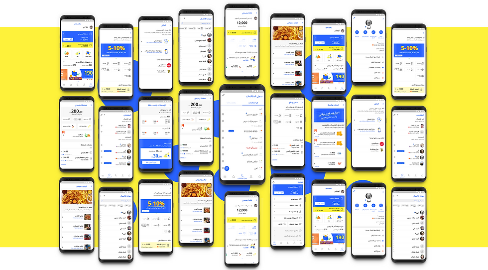
Building a new color system could be tricky since our brand has been associated with the color green. But we have been mis perceived as one of the operator’s companies in Egypt because of the similarity in the color tone. We based our new color system on a primary system that includes the colors Bright Blue, and Sunshine Yellow, and the secondary system includes Red, Green, Purple and Orange. Each color serves a purpose to have better communication for our brand and it’s positioning.

Why did we choose these colors?
We wanted to reflect reliability, trust, honesty, and productivity. Hence, we chose The Bright Blue and Sunshine Yellow. For the secondary colors we decided to do a hyped up version of current operators' colors. Since we believe that we’re offering the evolution of the current telecom dynamic, we modernized their colors and made them secondary.
Why is our new logo structure based on the circle shape?
Raseedi has been evolving, adding new features and expanding its offerings. We needed to have a platform that hits more on the emotional brand perception, and to be as abstract for easy adaptation to future expansions. The circle means unity, wholeness, and community. It represents our core features and perfectly represent our community. We even thought of how this branding can be the same with regional expansion in non arabic speaking countries

Logos are a symbol of identification for brands. But why we are building a logo system?
A logo is a static symbol, while a logo system gives brands an opportunity to expand the logo graphical framework to fit in different contexts and environments. Leading to a better recognition and representation of the brand.

Putting the colors into action. We worked on building a shape system that complements our concept of the circle. Over the coming weeks, you are going to see Raseedi in the new look. This will be reflected on our mobile application, website, social media accounts, and any business communication material.

If you would like to know more about our Design Thinking process, DM Raseedi and our team will get back to you 😉
Comments